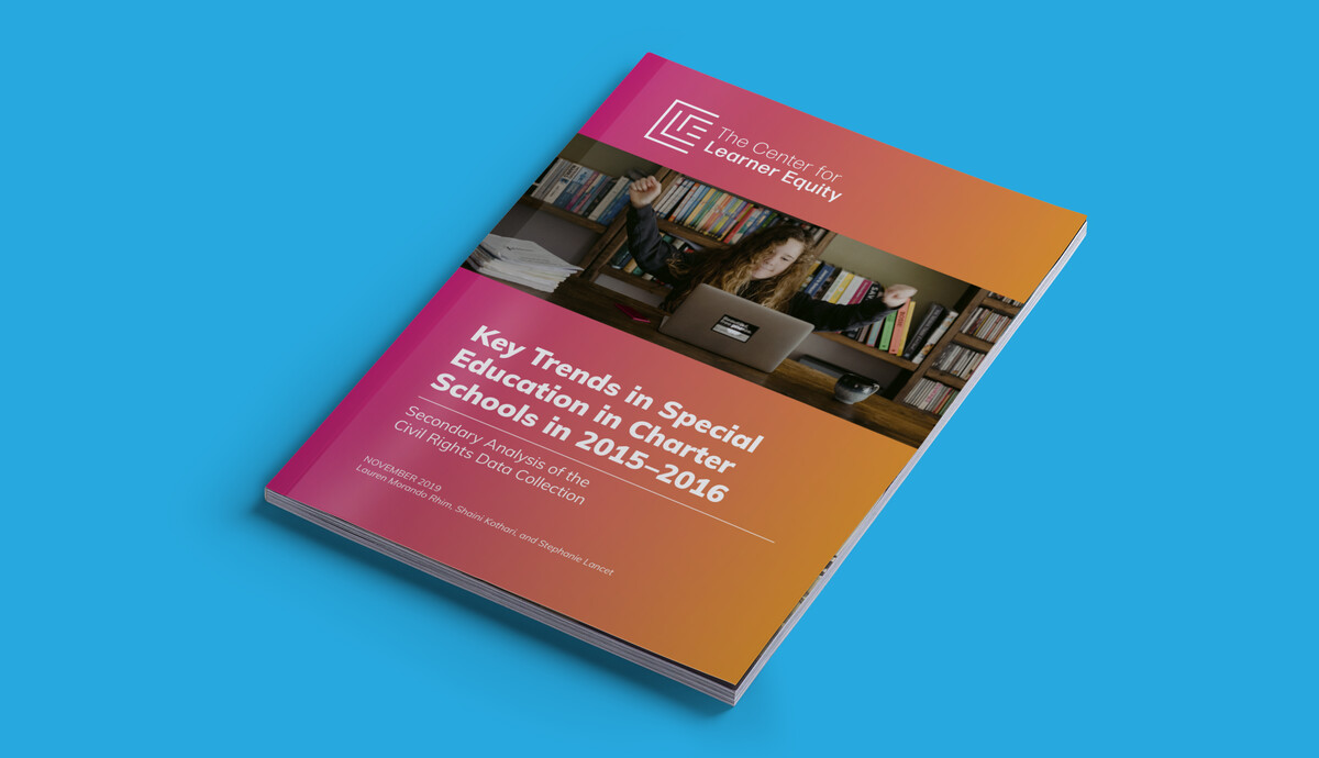
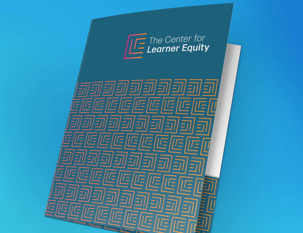
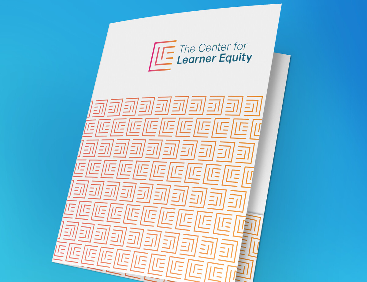
This logo and rebranding project was spurred by this non-profit client's change of name, from The National Center for Special Education in Charter Schools to The Center for Learner Equity.
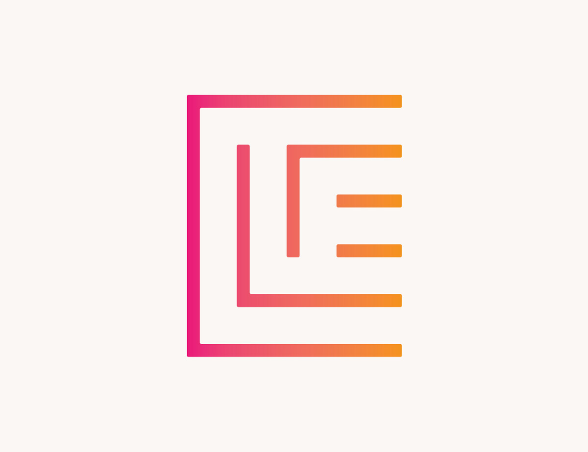
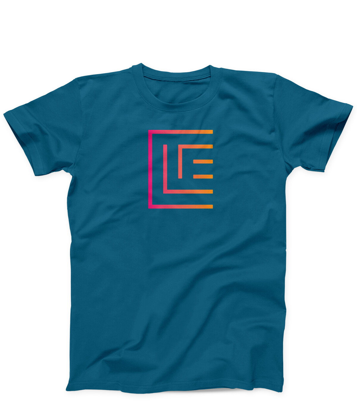
The organization's mission is to open pathways to equity and success for all learners, and the mark echoes this mission by creating pathways through the C, L, and E in the monogram. The multiple pathways represent the diversity of necessities among learners with special needs. The mark also renders the organization's monogram in both the positive and negative space, a nod to the fact that some challenges in public education are obvious while others are more subtle. Finally, in the E of the mark, an equal sign is visible, a symbol of the equity of experience and equality of results that The Center seeks for all learners.
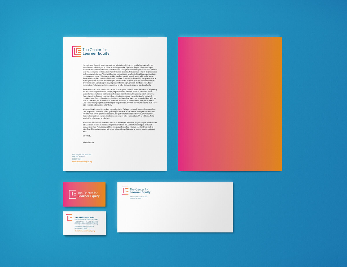
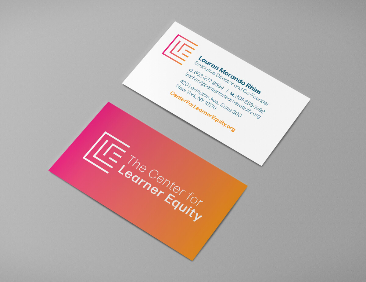
Our client had asked us to explore continuing to use their existing color palette, which made the new mark slide seamlessly into their existing website and helped to preserve some brand equity. In addition to business materials and other deliverables, we also created a special logo-presentation book to sell the mark through to the board, which voted unanimously in its favor.

