Fontaine Bros. is a fourth-generation, family-run construction company based in Springfield, Massachusetts. They came to us after seeing our work for Dore & Whittier Architects, and asked for help refreshing their identity and building a new website.
When we met with Dave Fontaine, Jr., he helped us understand what made the company special: The company was started by Dave’s great grandfather in the middle of the Great Depression. They believe in self-performing their own trades (masonry, concrete, carpentry, etc.) instead of farming it out, like others do. The company’s senior leadership (Dave Jr, his dad, his uncle, etc.) are personally involved in all the company’s projects. And they have a portfolio of major projects going back decades, spread out all across the Commonwealth.
All of this was important to help them stand out against the ‘big guys’ – huge, national construction companies that tended towards a less personal approach.
Once our research and discovery work was complete, the first step was to address their logo. The old logo had been around for a while, but it wasn’t a strong mark nor was it easy to use. We all felt pretty confident that a new logo would better position the company moving forward, but Dave was understandably concerned that some in the family might not be ready to switch things up. Once we started showing them new options, however, everyone embraced the change.
The new logo references the letter ‘F’ and uses a three-dimensional effect to convey the façade of a building. It feels stable and substantial, something appropriate for a company that’s been around since 1933. It also conveys a contemporary design aesthetic that should stand the test of time.
With the new identity in place, we started developing their new website. We’ve been partnering with Eternity Web Development on a lot of web projects lately, and this felt like another great fit. Fontaine’s old site was pretty tired, so it was quickly agreed that we should start with a clean slate.
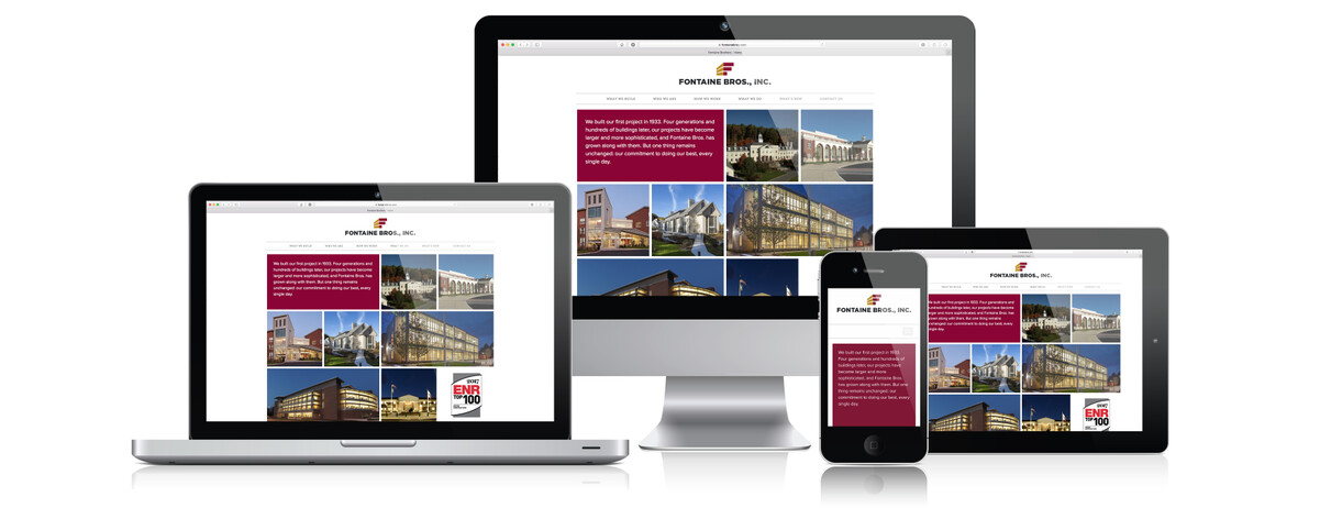
Eternity developed the site on the MODX platform, so the design is completely responsive on tablets and phones. It gives the client an intuitive CMS so they can update content on their own. And it’s open source, so they’re never tied down to a custom platform.
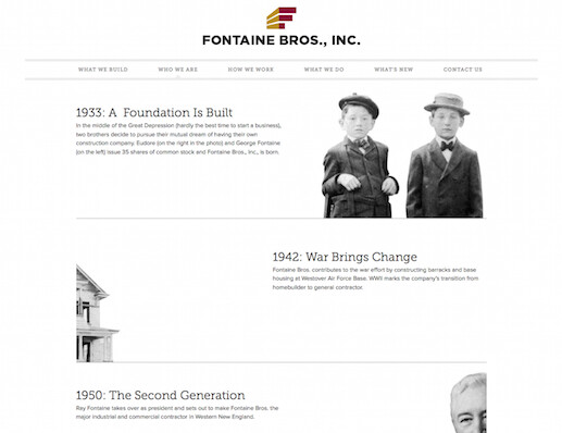
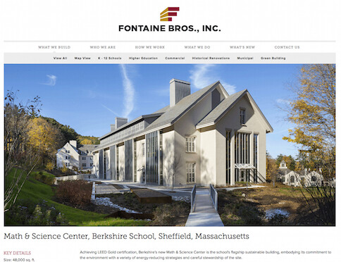
Methodikal did all the design work as well as the website copywriting and content development. The site’s copy tells the company’s story in a personal way to help set it apart. Instead of using the same old terms for the navigation, we gave it a first-person voice that’s still intuitive to use. The design makes great use of their portfolio images and mixes in some archival shots to tell the family’s story. The portfolio can also viewed in a Google Map view, which helps convey the breath of Fontaine’s work across Massachusetts.
We’re really excited about this project. When a client has such a rich story to tell, it makes our jobs a lot of fun.
