With Gin + Tonic season still running strong, thoughts of juniper (the berries that give flavor to Bombay, Hendricks, Tanqueray, et al) are fresh in our minds. As is this new logo and brand identity we just designed for Junapr, a PR and crisis communications firm here in Vermont.
Nicole Junas Ravlin, the founder of Junapr, is one of the best PR people in Vermont and New England, as well as a good friend of Methodikal. A few months ago she launched a new shop and asked us to help with the initial branding.
First, came name development. Nicole was leaning toward just using her maiden name, Junas, for the firm, but we suggested going through a name exploration to make sure there wasn’t something better out there. The problem with naming a firm after the principals is that if your firm is named “Smith & Johnson,” most clients are going to want to work with either Smith or Johnson, and not another member of the staff who could be perceived as lesser-than.
We landed on Junapr for a few reasons. First, it’s a nice combo of Junas and PR, which is pretty on-the-nose for this one. Second, it’s the name of the main island you see off Burlington in Lake Champlain, so there’s a hometown connection. And third, juniper berries are said to “impart a sharp, clear flavor,” and if you know Nicole, that’s spot on too.
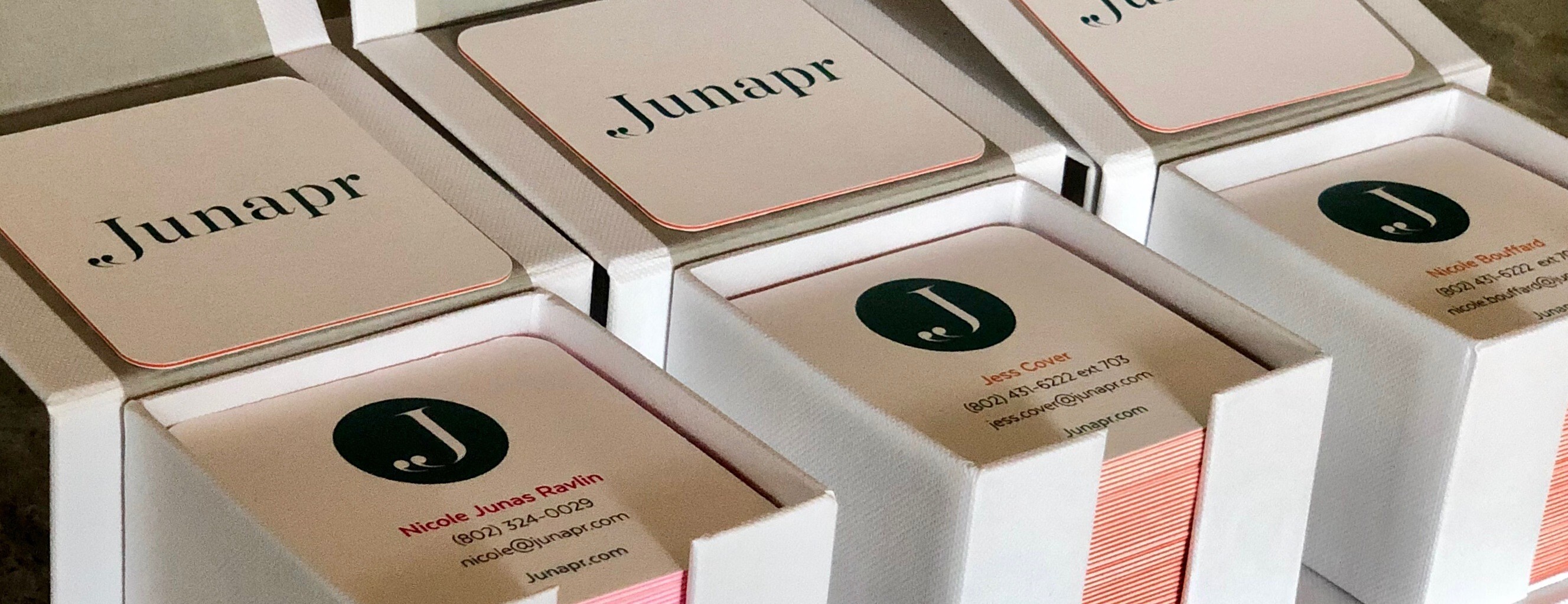
After the name, we dug into the logo design. We love how it turned out. The double quotation mark that forms the bottom of the J implies the start of a conversation, which is really what any great PR firm is in the business of doing for its clients. The rest is clear and classy, with a fun color palette to round things out. Go get ’em, Nicole.