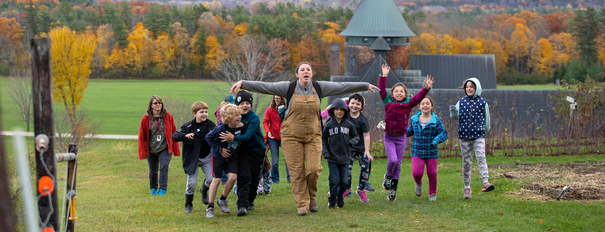
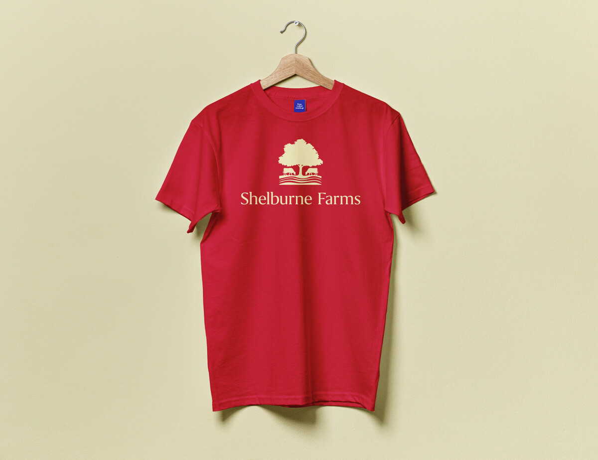
Shelburne Farms is one of the more venerable non-profit organizations in Vermont, yet despite the easy name recognition, many people had little understanding of its greater mission. Folks loved visiting the iconic landscape, but that was not the type of awareness our client was looking to build. Just the opposite, actually. In a nutshell, they want to be known as the place that educates the educators, helping to spread practices of sustainability to schools across the country.
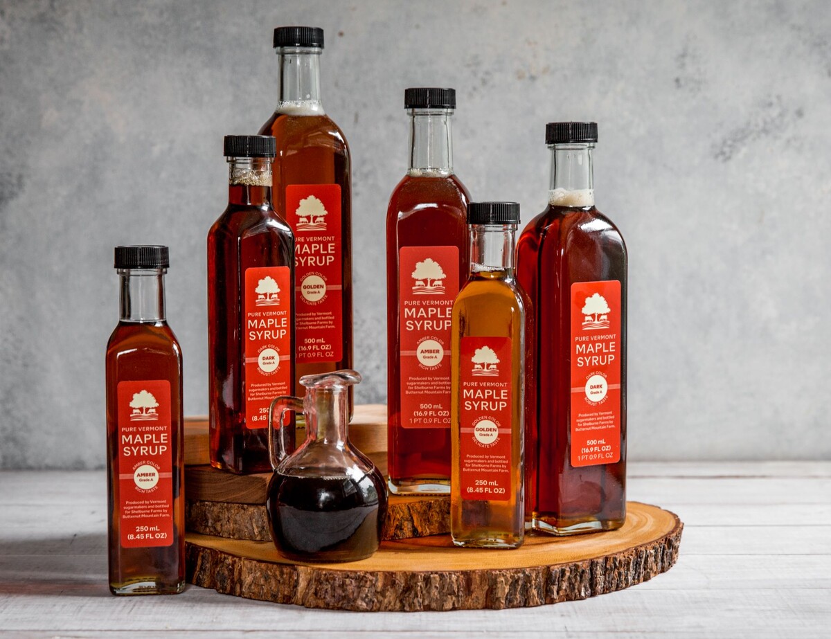
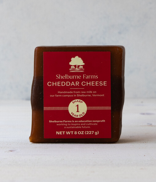
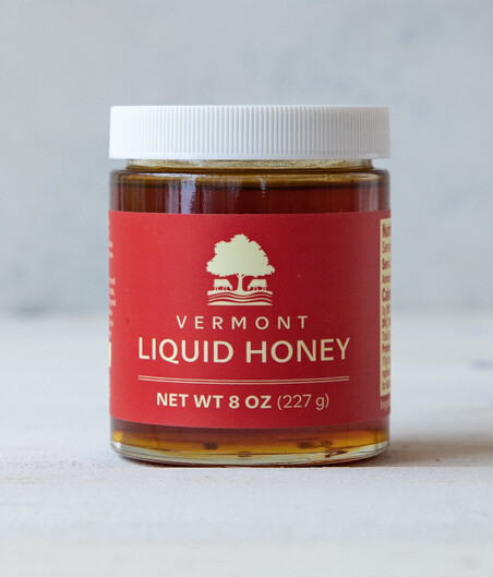
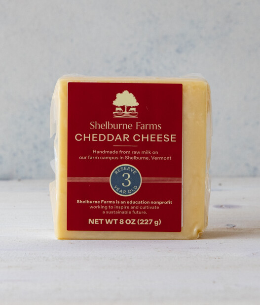
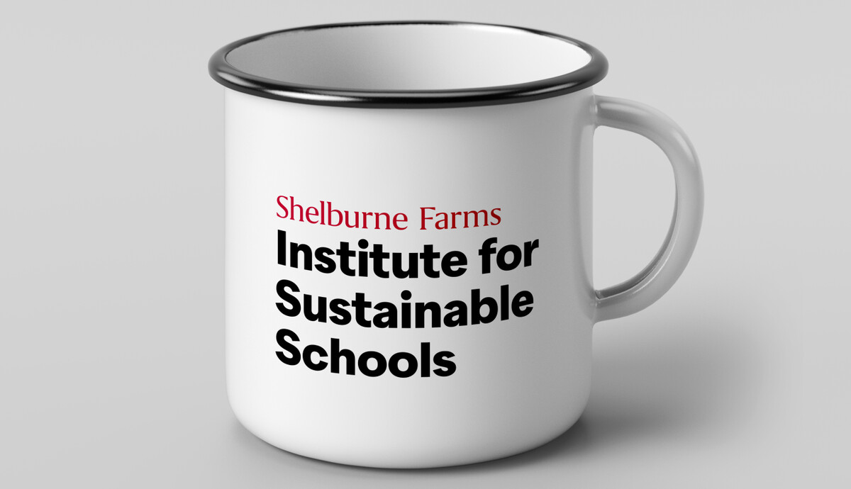
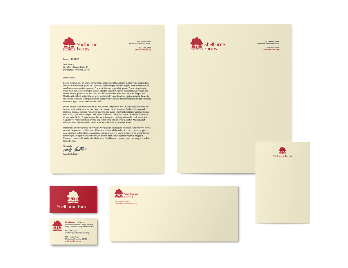
The Farms hired Methodikal to be their branding firm and update the graphic identity to better support its mission, as well as clarify a hodgepodge of logo variations that had cropped up over the years so the brand could be presented consistently and compellingly across every application. So, yes, it had to look great on packaging designs for a delicious block of aged clothbound cheddar or the menu for the Shelburne Farms Inn, but it also had to be flexible enough so it could promote the Shelburne Farms Institute for Sustainable Schools without muddying the waters.
Our graphic design work included careful consideration of which elements of the existing brand identity should remain, which should go by the wayside, and which needed to evolve to better support the mission. In the end, we landed on a solution that simplified the logo significantly, while preserving its heritage and setting Shelburne Farms up for decades of continued success.
